How to Preload Largest Contentful Paint Image
Preloading the critical resources on a Web Page can bring numerous performance benefits.
One such resource is the LCP Element and today we will be discussing various techniques to preload it.
For the majority of Websites, the Largest Contentful Paint Element is an image, and prioritizing its loading not just helps with a higher Web Vitals Score but also results in a better user experience.
Let’s jump right into the techniques to implement the same.
Why You Should Preload LCP Image
The Largest Contentful Paint is simply a measure of how long a Web Page takes to display the largest content on screen.
The Largest visible Content in the viewport is usually an Image or Text for most websites.
The idea behind Preloading Largest Contentful Paint Image is to prioritize its loading over the other resources on the page.
Let’s understand the same with an example.
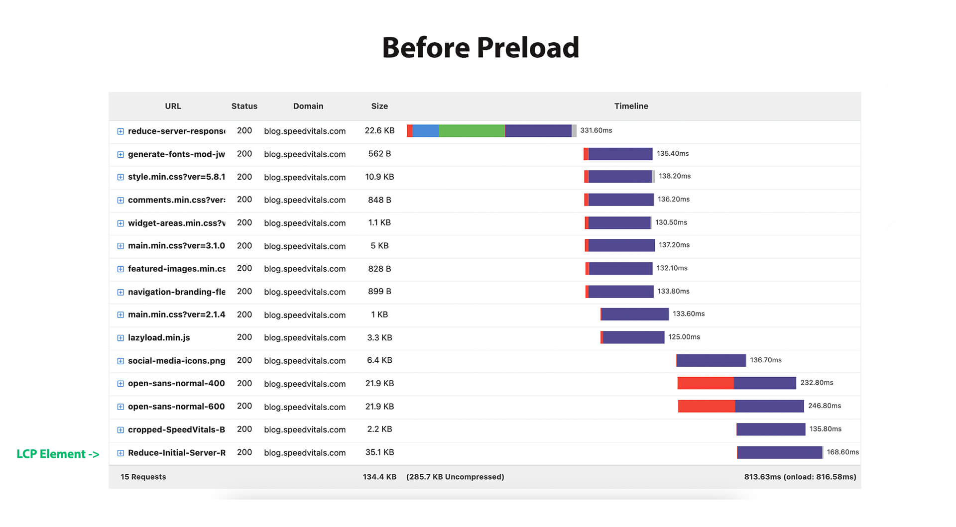
In this Waterfall Chart, the request for the LCP Image is at the end which is not ideal for Web Performance.

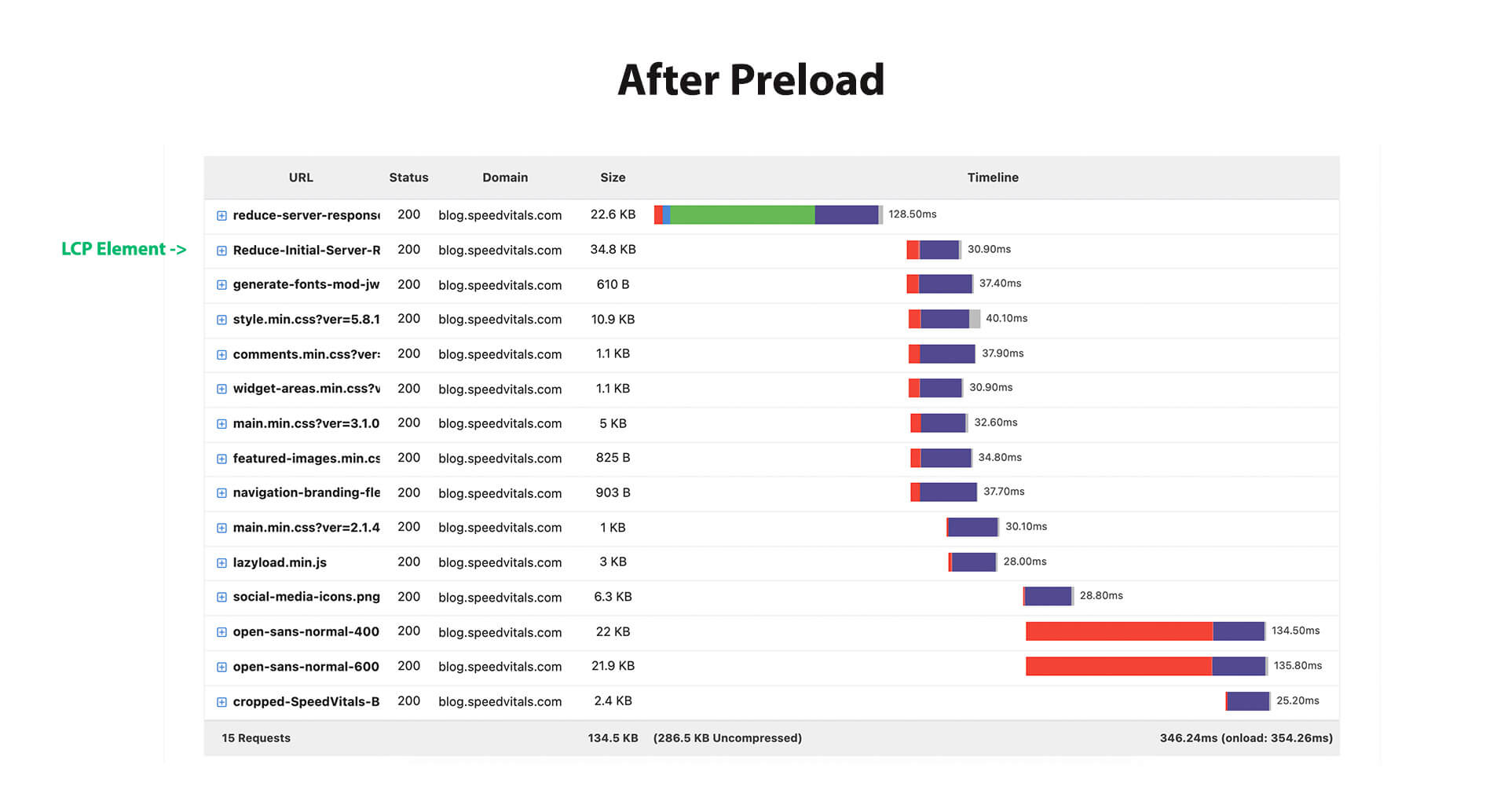
After preloading the Largest Contentful Paint Image, it is at the top just after the document itself. This was made possible by putting the preload snippet in the Head section of the Web Page before loading any other resources.

The end result? The Largest Contentful Paint Metric of the Page will see a major boost.
Let’s see how well Preloading is supported on different Web Browsers.
Browser Support
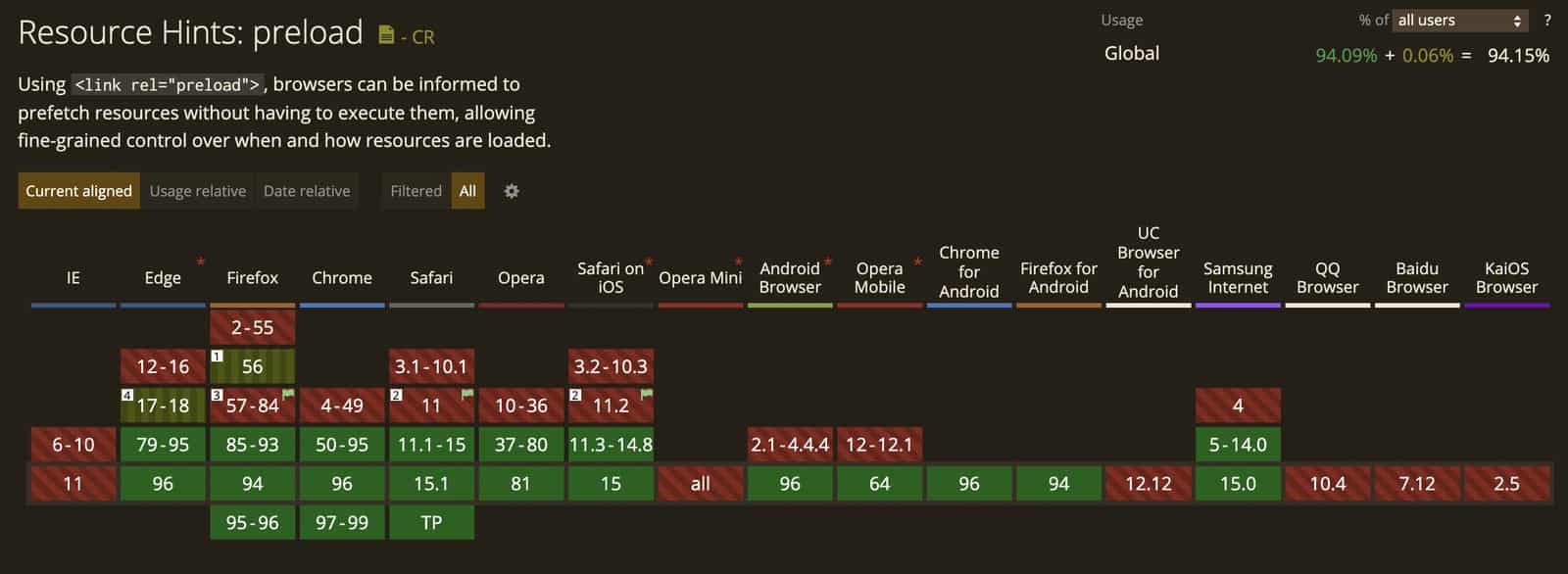
On almost all the Modern Browsers that have a high market share, Preloading is supported.

If you enable preloading, more than 94% of the users will see a performance benefit. This number will likely be even higher based on the Browser Usage of your Website audience.
How to Preload LCP Image
Preloading the LCP Image is as simple as adding a single line of code inside the HEAD Tag for most websites.
But first, you need to make sure that you’re preloading the correct image. To check the same, head over to SpeedVitals.com and perform the Web Vitals test on multiple devices to ensure that your LCP Element is the same on the majority of Devices.
This ensures that you don’t preload an image that won’t be an LCP Element on other devices. For example, if an Image is the LCP Element on Desktop but you’re not displaying it on Mobile then preloading it on Mobile will instead degrade the performance due to that extra request.
I’ve divided this section into two parts: for All Custom Websites and for WordPress.
For All Websites
This section is for Custom Websites whose source code you have access to. We will be discussing two types of preload snippets based on whether your Image is Responsive or Not.
For Non-Responsive Images
If the LCP Image is a simple image without any srcset attributes (that is used to load a different sized image at different resolutions for performance benefits), then preloading is extremely simple.
Just copy, the value of the src tag and paste it in the below snippet as the value of href attribute.
<link rel="preload" as="image" href="image.png" />
Place this at the top of Head Tag in your Web Page before loading any CSS/JS files.
If your LCP Image is the Background Image of an Element and is included using CSS using a code similar to the one given below, you can again use the same technique as above. Just replace the link to that resource, i.e. /images/image.png in this example, in the href attribute of the preload tag.
#hero-section {
    background: url(/images/image.png);
}
For Responsive Images
If your LCP Element is a responsive image with srcset and/or sizes attributes in the image tag, you’ll need the following snippet to preload them.
<link rel="preload" as="image" href="" imagesrcset="" imagesizes="" />
Let’s understand the same using an example.
Image Tag:
<img width="1100" height="616" src="/images/full.jpg"
class="attachment-full size-full"
srcset="/images/full.jpg 1100w,
/images/large.jpg 1024w,
/images/medium.jpg 768w,
/images/small.jpg 335w"
sizes="(max-width: 1100px) 100vw, 1100px">
This is what our responsive image tag looks like where we have multiple images in the srcset that will load based on the User’s device width.
All we need to do is to copy the values of src, srcset, and sizes attributes and paste them on the href, imagesrcset, and imagesizes attributes respectively.
Preload Tag:
<link rel="preload" as="image" href="/images/full.jpg"
imagesrcset="/images/full.jpg 1100w,
/images/large.jpg 1024w, /images/medium.jpg 768w,
/images/small.jpg 335w"
imagesizes="(max-width: 1100px) 100vw, 1100px" />
Make sure that you’re using the correct attribute name. The attribute srcset and sizes will turn into imagesrcset and imagesizes inside the preload tag.
Automatic Suggestion
Don’t want to go through the hassle of writing the preload tag manually?
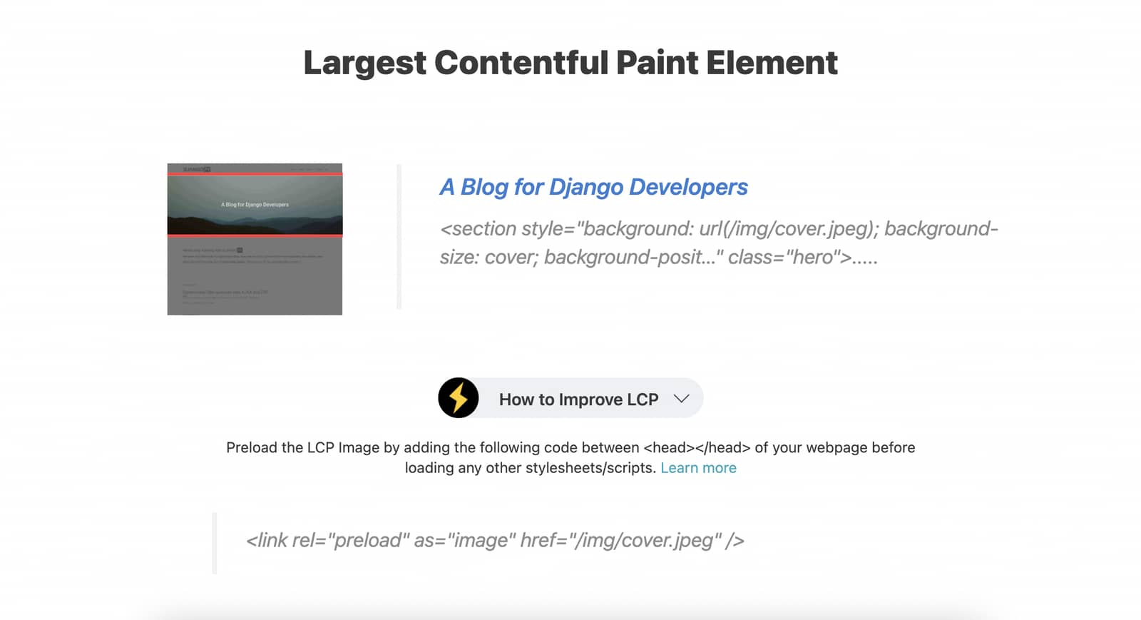
Our Web Vitals Test tool can automatically give preload snippets that you can add to your website. It works for Non-Responsive, Responsive, as well as Background Images.
Simply, head over to SpeedVitals.com and perform a test. Scroll down to the LCP Element and click on the dropdown that says “How to Improve LCP“.

Just copy the preload snippet shown and paste it between the Head Tag of the Web Page.
For WordPress Featured Image
For CMSs like WordPress, it is not feasible to repeat the manual process for each page on your Website. Hence, you’ll need an approach that can automatically inject the Preload snippet on every Page with a Featured Image.
Luckily, it is an extremely simple step that can be implemented using a Plugin.
Using a Plugin
One of my favorite WordPress caching plugins FlyingPress already has this feature. Unfortunately, WP-Rocket is yet to implement it.
If you need a separate plugin for this job, you can install Preload Featured Images by WPZOOM.
Manually using a PHP Snippet
You can also manually place a PHP Code that will automatically preload the featured image. You can learn more about it in this article written by Jackson Lewis.
