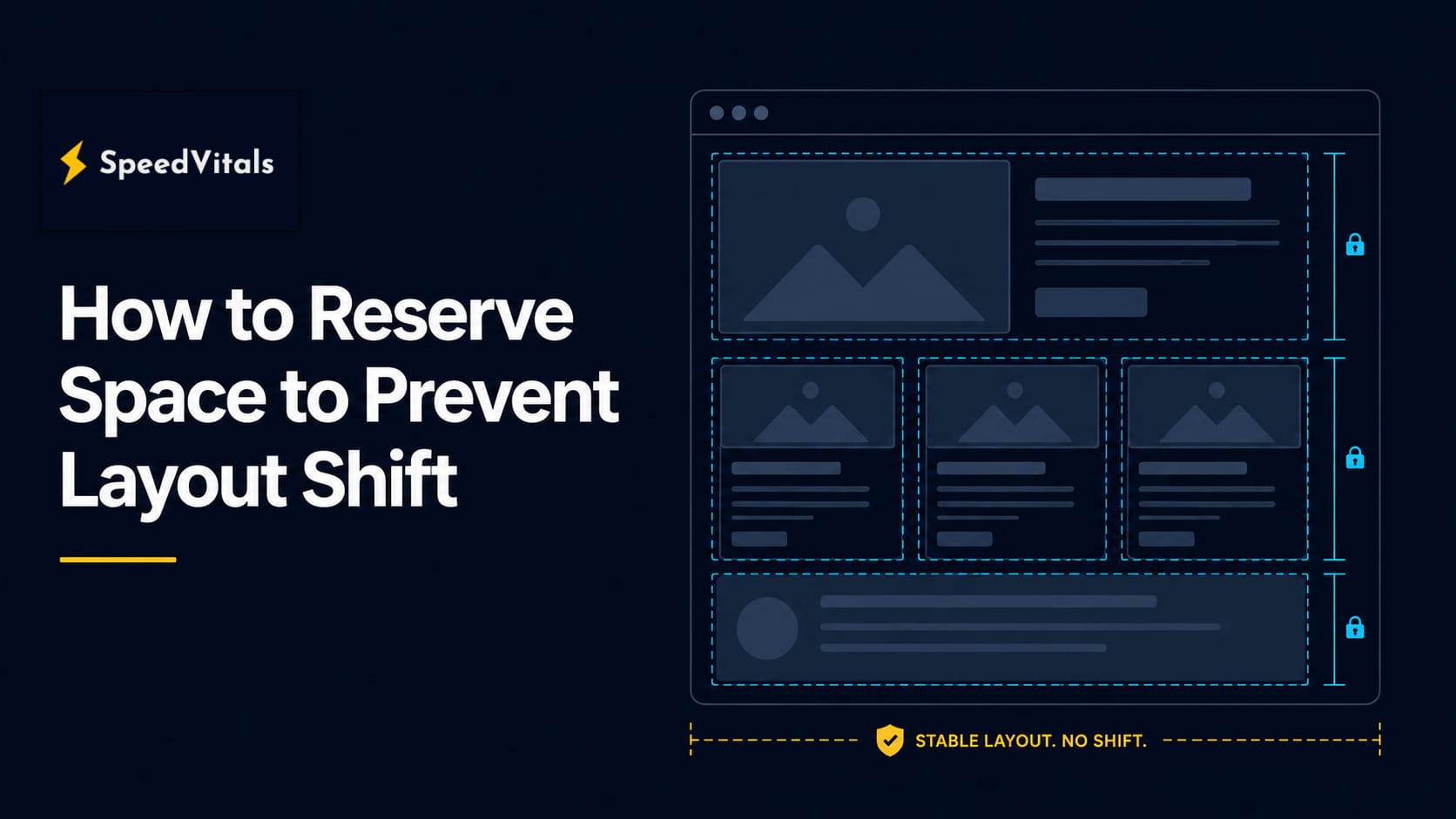
How to Reserve Space to Prevent Layout Shift

If you found this article, you probably saw a warning about layout shift, CLS, or "Avoid large layout shifts" while testing your website.
In simple terms, some element on your web page has moved after the page has already started loading. It could be an image, ad, iframe, font, cookie banner, product card, or any content loaded by JavaScript.
This is not just a small visual issue. When content moves unexpectedly, users lose their reading position, click the wrong element, or feel that the page is unstable.
The fix is usually to reserve the right amount of space before the element loads. When the browser already knows how much space an image, ad, embed, font, or dynamic component will need, it can build a stable layout from the beginning.
In this guide, you will learn what layout shift is, why it affects Cumulative Layout Shift (CLS), and how to reserve space for images, ads, embeds, fonts, skeletons, dynamic content, and WordPress websites.
What Is Layout Shift?
A layout shift happens when a visible element changes its position from one rendered frame to the next.
For example:
- Text moves down after an image loads.
- A button shifts after a banner is inserted.
- A product card jumps when its image dimensions become known.
- A heading changes height after a web font loads.
- An iframe expands after its third-party content finishes rendering.
The important point is this: layout shift is not just about something being added to the page. It becomes a problem when that addition or resize causes existing visible content to move unexpectedly.
This is why layout shift usually happens during:
- Image loading
- Lazy loading
- Ad rendering
- Iframe and embed loading
- Font swapping
- JavaScript-rendered components
- Cookie banners and announcement bars
- Infinite scroll and dynamic content insertion
A stable page tells the browser the expected size of important elements before the resources are fully available.
Why Reserving Space Prevents Layout Shift
Browsers create layout before every asset has finished loading.
If an image, iframe, ad, or component has no known dimensions, the browser may initially allocate little or no space for it. Later, when the resource loads and the actual height becomes available, the browser has to recalculate the page layout.
That recalculation pushes nearby content.
Reserving space solves this by giving the browser enough layout information upfront.
Instead of this:
<img src="/hero.jpg" alt="Hero image">
Use this:
<img
  src="/hero.jpg"
  width="1200"
  height="675"
  alt="Hero image"
>
The browser can now calculate the aspect ratio immediately and reserve the correct height even before the image file has downloaded.
This is one of the simplest and most effective ways to prevent CLS.
How Layout Shift Affects Core Web Vitals
Cumulative Layout Shift measures visual stability. A lower CLS means users are less likely to experience unexpected movement.
For a good user experience, Google recommends a CLS score of 0.1 or less at the 75th percentile of page loads across mobile and desktop. A score above 0.25 is considered poor.
| CLS Score | Rating | Meaning |
|---|---|---|
| 0.1 or less | Good | The page is visually stable for most users |
| 0.1 to 0.25 | Needs Improvement | Some users may experience noticeable movement |
| Above 0.25 | Poor | Layout instability is likely hurting user experience |
CLS is especially important because layout shifts are not just visual issues. They can cause real usability problems.
A user may:
- Lose their reading position
- Tap the wrong button
- Abandon a form
- Misclick an ad or product link
- Perceive the page as slower than it actually is
Layout stability also affects how users perceive LCP. Even if your Largest Contentful Paint element appears quickly, the page can still feel poor if the surrounding layout keeps moving. If your main issue is that the hero image itself is discovered too late, you should also check how to preload the LCP image.
A fast page that jumps around does not feel fast.
Common Causes of Layout Shift
Most CLS issues come from elements that load late without reserved dimensions.
| Cause | Why It Shifts | Typical Fix |
|---|---|---|
| Images without dimensions | Browser does not know the final image height | Add width and height attributes |
| Responsive images with inconsistent ratios | Different image candidates have different shapes | Keep the same aspect ratio or define ratios per breakpoint |
| Ads | Ad slot loads after page layout is created | Reserve a fixed or minimum ad container height |
| Embeds and iframes | Third-party content resizes after loading | Wrap in an aspect-ratio container |
| Lazy-loaded content | Content appears after scroll without space | Use placeholders, skeletons, or min-height |
| Fonts | Web font metrics differ from fallback font | Use better fallbacks, preload fonts, and metric overrides |
| Dynamic components | JavaScript inserts content above existing content | Reserve a container or insert after user interaction |
| Sticky bars and banners | Page content is pushed after banner appears | Reserve header/banner space or overlay it |
The fix is usually not complicated. The difficult part is identifying which element caused the movement.
How to Reserve Space for Images
Images are one of the most common causes of layout shift.
The best practice is to always include width and height attributes on image elements. These attributes do not force the image to render at that exact pixel size when responsive CSS is used. Instead, modern browsers use them to calculate the image's aspect ratio.
Good Image Markup
<img
  src="/images/product.jpg"
  width="800"
  height="600"
  alt="Product preview"
>
Then make it responsive with CSS:
img {
  max-width: 100%;
  height: auto;
}
This combination gives the browser the intrinsic aspect ratio while still allowing the image to scale with the layout.
Bad Image Markup
<img src="/images/product.jpg" alt="Product preview">
Without dimensions, the browser may not know how much vertical space to reserve until the image starts downloading.
Responsive Images With Srcset
Responsive images should still include dimensions.
<img
  src="/images/product-800.jpg"
  srcset="
    /images/product-400.jpg 400w,
    /images/product-800.jpg 800w,
    /images/product-1200.jpg 1200w
  "
  sizes="(max-width: 768px) 100vw, 768px"
  width="800"
  height="600"
  alt="Product preview"
>
The important rule is that the image candidates in srcset should use the same aspect ratio.
If one image is 4:3 and another is 16:9, the browser may reserve one ratio and later render another, causing movement.
Picture Elements and Art Direction
Sometimes mobile and desktop intentionally use different crops. In that case, define dimensions on the source elements where supported and ensure the fallback img also has dimensions.
<picture>
  <source
    media="(max-width: 767px)"
    srcset="/images/hero-mobile.jpg"
    width="600"
    height="750"
  >
  <source
    media="(min-width: 768px)"
    srcset="/images/hero-desktop.jpg"
    width="1440"
    height="600"
  >
  <img
    src="/images/hero-desktop.jpg"
    width="1440"
    height="600"
    alt="Dashboard preview"
  >
</picture>
For art-directed images, test both desktop and mobile. CLS problems often appear only on one viewport because the crop, container width, or text wrapping changes.
CSS Aspect Ratio for Image Containers
If you do not control the image markup directly, reserve space on the wrapper.
<div class="image-frame">
  <img src="/images/article-cover.jpg" alt="Article cover">
</div>
.image-frame {
  aspect-ratio: 16 / 9;
  width: 100%;
  overflow: hidden;
}

.image-frame img {
  width: 100%;
  height: 100%;
  object-fit: cover;
}
This is useful for CMS content, card grids, thumbnails, and user-generated images.
How to Reserve Space for Ads and Embeds
Ads and embeds are harder than images because their final size may depend on a third-party script.
Still, you should never allow an ad or embed container to start at 0px height if it will later appear inside the content flow.
Reserve Space for Ad Slots
<div class="ad-slot ad-slot-sidebar">
  <!-- Ad script renders here -->
</div>
.ad-slot {
  display: block;
  width: 100%;
  min-height: 250px;
  background: #f5f5f5;
}

.ad-slot-sidebar {
  min-height: 280px;
}

@media (max-width: 767px) {
  .ad-slot {
    min-height: 320px;
  }
}
The correct height depends on your ad inventory. Use historical ad sizes, common slot dimensions, and device-specific behavior to choose a realistic value.
If the ad does not load, avoid collapsing the container immediately. Removing reserved space can cause the same CLS problem as inserting the ad late.
Reserve Space for YouTube, Maps, and Iframes
Embeds should usually be wrapped in an aspect-ratio container.
<div class="embed-frame">
  <iframe
    src="https://www.youtube.com/embed/video-id"
    title="Video"
    loading="lazy"
    allowfullscreen
  ></iframe>
</div>
.embed-frame {
  aspect-ratio: 16 / 9;
  width: 100%;
}

.embed-frame iframe {
  width: 100%;
  height: 100%;
  border: 0;
}
This prevents the iframe from appearing as a small or zero-height element before expanding.
Ads Above the Fold
Be especially careful with ads near the top of the page.
A late-loading ad above the article title, product grid, or main content can create a large CLS score because it moves a large part of the viewport.
For above-the-fold ads:
- Reserve the slot in the initial HTML.
- Use breakpoint-specific heights.
- Avoid injecting the slot after rendering.
- Avoid collapsing the slot if no ad is returned.
- Prefer placing uncertain ad slots lower on the page.
How to Reserve Space for Dynamic Content
Dynamic content is content added after the initial HTML is rendered. This includes recommendations, reviews, related posts, product cards, filters, personalization blocks, and JavaScript-rendered UI.
If this content appears in the normal document flow, reserve its space.
Use Min-Height for Dynamic Sections
<section class="related-products">
  <h2>Related Products</h2>
  <div id="related-products-list"></div>
</section>
.related-products {
  min-height: 420px;
}
This gives the browser enough space before the JavaScript finishes loading.
Use Skeletons for Predictable Components
Skeletons work well when the final layout is known.
<div class="product-card product-card-skeleton">
  <div class="product-card-image"></div>
  <div class="product-card-title"></div>
  <div class="product-card-price"></div>
</div>
.product-card {
  display: grid;
  gap: 12px;
}

.product-card-image {
  aspect-ratio: 4 / 3;
  background: #eee;
}

.product-card-title {
  height: 20px;
  width: 80%;
  background: #eee;
}

.product-card-price {
  height: 18px;
  width: 40%;
  background: #eee;
}
The skeleton should match the final component dimensions closely. A skeleton that is much shorter than the final content still causes layout shift.
Avoid Inserting Content Above Existing Content
This is a common issue with:
- Cookie banners
- Newsletter bars
- Promo banners
- App install prompts
- Login prompts
- Personalization widgets
Bad approach:
document.body.prepend(promoBanner);
This pushes the whole page down after the user has already started viewing it.
Better approaches:
- Reserve banner space in the initial layout.
- Render the banner server-side.
- Use an overlay when appropriate.
- Show the content after a user action.
- Insert new content below the current viewport.
Infinite Scroll and Load More
Infinite scroll can create post-load layout shifts if new items are inserted above or inside the visible viewport.
For stable loading:
- Append new items below the current list.
- Give cards fixed image ratios.
- Use skeleton rows before data arrives.
- Avoid changing the height of already-rendered cards.
- Use a "Load More" button when the shift would otherwise surprise users.
Layout shifts shortly after direct user input may be treated differently by CLS measurement, but the user experience still matters. Do not rely on the metric exception as a design strategy.
If JavaScript-heavy widgets are also delaying rendering or blocking interaction, fixing layout stability should be combined with delaying JavaScript safely.
How to Reserve Space for Fonts and Text
Fonts can also cause layout shift.
When a web font loads, it may replace the fallback font. If the fallback font has different metrics, text can become wider, narrower, taller, or shorter. That can move surrounding content.
Use a Similar Fallback Font
Bad:
body {
  font-family: "Inter";
}
Better:
body {
  font-family: "Inter", Arial, sans-serif;
}
Always define a fallback font that is visually and metrically close to the web font.
Preload Critical Fonts
If a font is required for above-the-fold text, preload it.
<link
  rel="preload"
  href="/fonts/inter-var.woff2"
  as="font"
  type="font/woff2"
  crossorigin
>
Preloading helps the browser discover the font earlier, reducing the chance of late font swaps.
Only preload critical fonts. Preloading too many font files can delay other important resources, including the LCP image.
Use Font Display Carefully
@font-face {
  font-family: "Inter";
  src: url("/fonts/inter-var.woff2") format("woff2");
  font-display: swap;
}
font-display: swap keeps text visible using a fallback font, then swaps to the web font when it loads. This is usually better than invisible text, but it can still cause layout shift if the metrics differ.
For some websites, font-display: optional may reduce re-layout because the browser can keep the fallback font if the web font is not available early enough.
@font-face {
  font-family: "Inter";
  src: url("/fonts/inter-var.woff2") format("woff2");
  font-display: optional;
}
Use this only when accepting the fallback font is fine for your design.
Use Font Metric Overrides
Modern CSS allows you to tune fallback font metrics with properties such as:
size-adjustascent-overridedescent-overrideline-gap-override
Example:
@font-face {
  font-family: "Inter Fallback";
  src: local("Arial");
  size-adjust: 107%;
  ascent-override: 90%;
  descent-override: 22%;
  line-gap-override: 0%;
}

body {
  font-family: "Inter", "Inter Fallback", sans-serif;
}
This can reduce text reflow when the real font replaces the fallback. The exact values should be calculated based on your font pair instead of guessed.
Modern CSS Techniques for Preventing Layout Shift
Modern CSS gives us several tools to make layouts more predictable.
Aspect Ratio
aspect-ratio is one of the most useful CSS properties for layout stability.
.hero-media {
  aspect-ratio: 16 / 9;
}
Use it for:
- Images
- Videos
- Iframes
- Cards
- Product thumbnails
- User avatars
- Media grids
Min-Height
Use min-height when content height is variable but should never start from zero.
.testimonial-widget {
  min-height: 260px;
}
This is useful for:
- Reviews
- Recommendations
- Ads
- Search results
- Third-party widgets
- Related posts
CSS Grid and Fixed Tracks
Grid layouts can prevent cards from changing size unpredictably.
.product-grid {
  display: grid;
  grid-template-columns: repeat(auto-fit, minmax(220px, 1fr));
  gap: 24px;
}

.product-card__image {
  aspect-ratio: 1 / 1;
}
The image area remains stable even before the image loads.
Container Queries and Responsive Reservations
Mobile and desktop often need different reserved heights.
.hero {
  min-height: 520px;
}

@media (max-width: 767px) {
  .hero {
    min-height: 640px;
  }
}
Do not assume the desktop height works on mobile. Mobile text wraps into more lines, ads may use different sizes, and stacked layouts often need more vertical space.
Content Visibility and Intrinsic Size
For below-the-fold content, content-visibility: auto can improve rendering performance. When using it, define a realistic intrinsic size so the browser can reserve space before rendering the section.
.below-fold-section {
  content-visibility: auto;
  contain-intrinsic-size: 600px;
}
This is useful for long pages with expensive sections, but the intrinsic size must be close to the real rendered size. If it is far off, the page may still shift when the section becomes visible.
Practical Implementation Examples
Stable Hero Image
<section class="hero">
  <img
    class="hero-image"
    src="/images/hero.webp"
    width="1440"
    height="720"
    alt="Website performance dashboard"
    fetchpriority="high"
  >
  <h1>Analyze Your Website Performance</h1>
</section>
.hero {
  display: grid;
  gap: 24px;
}

.hero-image {
  width: 100%;
  height: auto;
  display: block;
}
This reserves space for the hero image and also helps LCP because the browser can prioritize the image.
Stable Card Grid
<article class="post-card">
  <a href="/blog/example">
    <img
      src="/images/blog-cover.jpg"
      width="800"
      height="450"
      alt="Blog cover"
    >
    <h2>How to Improve Core Web Vitals</h2>
  </a>
</article>
.post-card img {
  aspect-ratio: 16 / 9;
  width: 100%;
  height: auto;
  object-fit: cover;
}
This prevents each card from growing after the image loads.
Stable Placeholder for API Content
<section class="reviews" aria-busy="true">
  <div class="review-placeholder"></div>
  <div class="review-placeholder"></div>
  <div class="review-placeholder"></div>
</section>
.reviews {
  min-height: 360px;
}

.review-placeholder {
  height: 96px;
  margin-bottom: 16px;
  background: #eee;
}
When real reviews load, replace the placeholders inside the same reserved container.
Stable Cookie Banner
If the banner should push content down, reserve the space from the initial render.
<body class="has-cookie-banner">
  <div class="cookie-banner">
    This site uses cookies.
  </div>
  <main>
    ...
  </main>
</body>
.cookie-banner {
  min-height: 56px;
}

.has-cookie-banner main {
  padding-top: 0;
}
If the banner is not essential to document flow, overlay it instead.
.cookie-banner {
  position: fixed;
  left: 0;
  right: 0;
  bottom: 0;
  min-height: 64px;
  z-index: 1000;
}
An overlay avoids pushing content, but make sure it does not block important actions.
WordPress Implementation Guidance
WordPress sites commonly experience CLS from themes, page builders, lazy loading plugins, ads, embeds, and missing image dimensions.
Here are the most important areas to check.
Add Width and Height to Images
Modern WordPress usually outputs image dimensions for media library images, but problems can still happen with:
- Custom theme templates
- Page builder widgets
- Shortcodes
- Manually inserted HTML
- External images
- Lazy loading plugins
- CDN image rewrites
Inspect the final HTML, not just the editor view.
Good output should look like this:
<img
  src="image.jpg"
  width="1200"
  height="675"
  alt="Example"
  loading="lazy"
>
If your theme or plugin strips dimensions, fix the template or enable a reliable "add missing image dimensions" feature in your performance plugin. This is one of the same practical checks used in a full WordPress Web Vitals optimization workflow.
Using FlyingPress to Reduce CLS
FlyingPress can help reduce CLS automatically on many WordPress sites, especially when the shifts are caused by images, iframes, lazy loading behavior, fonts, or delayed rendering.
The most relevant FlyingPress features for layout stability are:
- Add missing width and height attributes: helps the browser reserve image space before the image file loads.
- Lazy load images and iframes carefully: improves loading performance while keeping media dimensions stable.
- Exclude above-the-fold images from lazy loading: prevents important hero or featured images from appearing too late.
- Optimize Google Fonts: reduces font-related reflow by handling font loading more predictably.
- Lazy render below-the-fold elements: can reduce initial rendering work, but should be tested to make sure it does not create new post-load shifts.
FlyingPress is useful because it solves several common WordPress CLS issues without needing custom code for every template. However, it cannot fix every layout shift automatically. Ads, cookie banners, page builder sections, sliders, and custom JavaScript widgets still need manual testing.
If you are choosing between caching plugins, the FlyingPress vs WP Rocket comparison explains how both plugins fit into Core Web Vitals optimization.
Reserve Space for Featured Images
For blog posts, category pages, and archive cards, featured images should have consistent ratios.
.post-thumbnail {
  aspect-ratio: 16 / 9;
  overflow: hidden;
}

.post-thumbnail img {
  width: 100%;
  height: 100%;
  object-fit: cover;
}
This is especially important on archive pages where many cards load together.
Reserve Space for Ads
If you use AdSense, Google Ad Manager, or another ad network, define slot sizes in your theme.
.single-post-ad {
  min-height: 280px;
  margin: 32px 0;
}

@media (max-width: 767px) {
  .single-post-ad {
    min-height: 320px;
  }
}
Avoid injecting ad containers into the article after load without a reserved slot.
Reserve Space for Embeds
WordPress embeds can load from YouTube, Twitter/X, Instagram, Maps, and other third-party platforms. Wrap these embeds in stable containers where possible.
.wp-block-embed__wrapper {
  aspect-ratio: 16 / 9;
}

.wp-block-embed__wrapper iframe {
  width: 100%;
  height: 100%;
}
Some embeds do not have a fixed ratio. In those cases, use min-height based on the typical rendered height.
Check Page Builder Sections
Page builders often load sliders, tabs, animations, and dynamic widgets after the initial render.
Check:
- Hero sliders
- Testimonials
- Product carousels
- Before/after widgets
- Popup bars
- Sticky headers
- Mobile menus
- Review widgets
If a widget appears late, give its section a minimum height or replace it with server-rendered content.
Good vs Bad Approaches
| Element | Bad Approach | Good Approach |
|---|---|---|
| Images | <img src="photo.jpg"> | Add width, height, and responsive CSS |
| Hero image | CSS background with no container height | Use an image element or reserve hero height |
| Responsive images | Different srcset ratios | Keep the same ratio or define ratios per breakpoint |
| Ads | Insert ad container after load | Render reserved ad slot in initial HTML |
| Embeds | Raw iframe with no dimensions | Wrap iframe with aspect-ratio |
| API content | Empty div that expands later | Use skeletons or min-height |
| Fonts | Custom font with poor fallback | Use close fallback, preload critical font, tune metrics |
| Banners | Inject at top after load | Reserve space or overlay carefully |
| Product cards | Image height based on load | Fixed media ratio in each card |
| Infinite scroll | Insert content above current viewport | Append below or use user-initiated loading |
Comparison of Space Reservation Techniques
| Technique | Best For | Benefit | Risk |
|---|---|---|---|
width and height attributes | Images and videos | Browser calculates aspect ratio early | Wrong dimensions can still cause shift |
aspect-ratio | Media containers, cards, embeds | Simple responsive space reservation | Needs correct ratio |
min-height | Ads, widgets, dynamic sections | Prevents zero-height containers | Can leave blank space if overestimated |
| Skeleton UI | API-loaded components | Preserves layout and improves perceived loading | Must match final layout closely |
| Fixed grid/card media areas | Product grids and article cards | Keeps repeated layouts stable | Cropping may require object-fit |
| Font preloading | Critical above-the-fold fonts | Reduces late font swaps | Too many preloads can hurt LCP |
| Font metric overrides | Text-heavy layouts | Reduces reflow between fallback and web font | Requires careful font metric calculation |
contain-intrinsic-size | Below-the-fold sections | Reserves space with deferred rendering | Bad estimates can still shift |
Desktop and Mobile Layout Shift Concerns
CLS should be checked separately on desktop and mobile.
Mobile pages often have higher layout shift risk because:
- Text wraps into more lines.
- Viewports are narrower.
- Ads use different sizes.
- Sticky headers take more vertical space.
- Images may use different crops.
- Lazy-loaded content enters the viewport sooner.
- Users scroll more during loading.
Desktop pages have different issues:
- Large hero sections can move a lot of visible content.
- Sidebar ads may resize independently.
- Multi-column layouts can shift when one column changes height.
- Web fonts can reflow wider headings and navigation menus.
Do not test only one viewport. A page can have excellent CLS on desktop and poor CLS on mobile.
Also remember that some navigations do not behave like fresh page loads. For example, Back/Forward Cache can restore a page from memory and avoid many shifts that would otherwise happen during a normal load.
How to Test CLS Improvement
You should measure layout stability before and after making changes.
Use both lab and field data where possible.
1. Run a Baseline Test
Start by testing the current page with a Web Vitals tool such as the SpeedVitals Website Speed Test, PageSpeed Insights, Lighthouse, or Chrome DevTools.
Record:
- CLS score
- Device type
- Network profile
- Viewport size
- Elements reported as shifting
- Screenshots or filmstrip if available
Do not compare results from different test conditions.
2. Identify the Elements That Shift
In Chrome DevTools:
- Open the page.
- Open DevTools.
- Go to the Performance panel.
- Start recording.
- Reload and interact with the page.
- Stop recording.
- Check the Layout Shifts track.
DevTools can show which elements moved and when the shift happened.
Important: the shifted element is not always the root cause. For example, a paragraph may be listed as shifted because an ad above it appeared late.
3. Test Mobile and Desktop Separately
Run tests for:
- Mobile viewport
- Desktop viewport
- Slow network
- Fast network
- Cached visit
- Uncached visit
CLS issues are often more visible on slower connections because images, fonts, ads, and JavaScript arrive later.
4. Compare Before and After
After implementing space reservation, compare the same page under the same conditions.
Look for:
- Lower CLS score
- Fewer layout shift events
- Smaller shift impact
- No movement around images, ads, embeds, and dynamic sections
- Stable visual load in the filmstrip
Do not rely on a single run. Run multiple tests to confirm the improvement is repeatable.
5. Check Field Data
Lab tools are useful for debugging, but field data shows what real users experience.
Use:
- Chrome UX Report data
- PageSpeed Insights field data
- Real User Monitoring
- Web Vitals attribution data
- SpeedVitals RUM if you want to monitor real-user CLS over time
Field CLS can include shifts that happen after initial load, such as shifts during scroll, lazy loading, route changes, or delayed third-party scripts.
Best Practices to Prevent Layout Shift
Follow these rules for most websites:
- Always add
widthandheightattributes to images and videos. - Use
aspect-ratiofor responsive media containers. - Keep responsive image candidates at the same aspect ratio.
- Reserve ad slots before the ad script runs.
- Avoid collapsing ad containers when no ad is returned.
- Give embeds and iframes a fixed ratio or minimum height.
- Use skeletons that match the final layout.
- Avoid injecting banners above existing content after load.
- Use close fallback fonts.
- Preload only critical fonts.
- Test CLS separately on mobile and desktop.
- Monitor field data, not just Lighthouse load results.
- Keep lazy-loaded content from entering the viewport without reserved space.
Common Mistakes to Avoid
Relying Only on Lazy Loading
Lazy loading improves bandwidth usage, but it does not automatically prevent layout shift.
This is bad:
<img src="/image.jpg" loading="lazy" alt="Example">
This is better:
<img
  src="/image.jpg"
  loading="lazy"
  width="800"
  height="450"
  alt="Example"
>
Lazy-loaded images still need dimensions.
Reserving Too Little Space
If a placeholder is much smaller than the final content, the page will still shift.
.widget-placeholder {
  min-height: 100px;
}
If the final widget is usually 400px tall, this only reduces the shift. It does not prevent it.
Collapsing Empty Ad Slots
If an ad slot reserves 280px and then collapses to 0px when no ad is returned, the content below moves upward.
That still contributes to visual instability.
A better approach is to keep the space, use a fallback, or collapse only when the slot is outside the viewport and unlikely to affect the current user experience.
Using Background Images Without Height
CSS background images do not define layout dimensions by themselves.
Bad:
.hero {
  background-image: url("/hero.jpg");
}
Better:
.hero {
  min-height: 520px;
  background-image: url("/hero.jpg");
  background-size: cover;
  background-position: center;
}
If the image is important content or the LCP element, consider using an actual <img> element instead.
Animating Layout Properties
Avoid animating properties that affect layout, such as:
topleftrightbottomheightwidthmarginpadding
Prefer transform-based animations:
.panel {
  transform: translateY(16px);
  opacity: 0;
  transition: transform 200ms ease, opacity 200ms ease;
}

.panel.is-visible {
  transform: translateY(0);
  opacity: 1;
}
Transform animations do not push surrounding content around.
Practical CLS Fixing Workflow
Here is a reliable process for fixing layout shift on any website:
- Test the page on mobile and desktop.
- Find the largest layout shift events.
- Identify what appeared, resized, or changed before the shifted element moved.
- Add dimensions, aspect ratio,
min-height, or a skeleton. - Retest under the same conditions.
- Repeat for post-load shifts during scroll and interaction.
- Monitor field CLS after deployment.
Start with the biggest visible shifts first. Fixing one above-the-fold ad, hero image, or font swap can often make a larger difference than many small changes lower on the page.
Conclusion
Reserving space is one of the most practical ways to prevent layout shift.
The browser cannot create a stable layout if important elements have unknown sizes. Images need dimensions. Embeds need ratios. Ads need slots. Dynamic components need placeholders. Fonts need predictable fallback behavior.
For most websites, the biggest wins come from:
- Adding
widthandheightto images - Using
aspect-ratiofor media and embeds - Reserving ad and widget containers
- Matching skeletons to final content
- Reducing font metric differences
- Testing CLS on both mobile and desktop
A stable page feels faster, more polished, and easier to use. If you are optimizing Core Web Vitals, do not treat layout shift as a cosmetic issue. Reserve the space early, verify the improvement with real testing, and keep monitoring CLS as your design, ads, plugins, and content change.